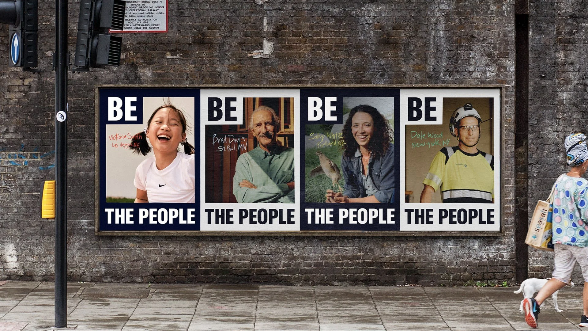
Be the People:
Preliminary Brand Identity Design Concept
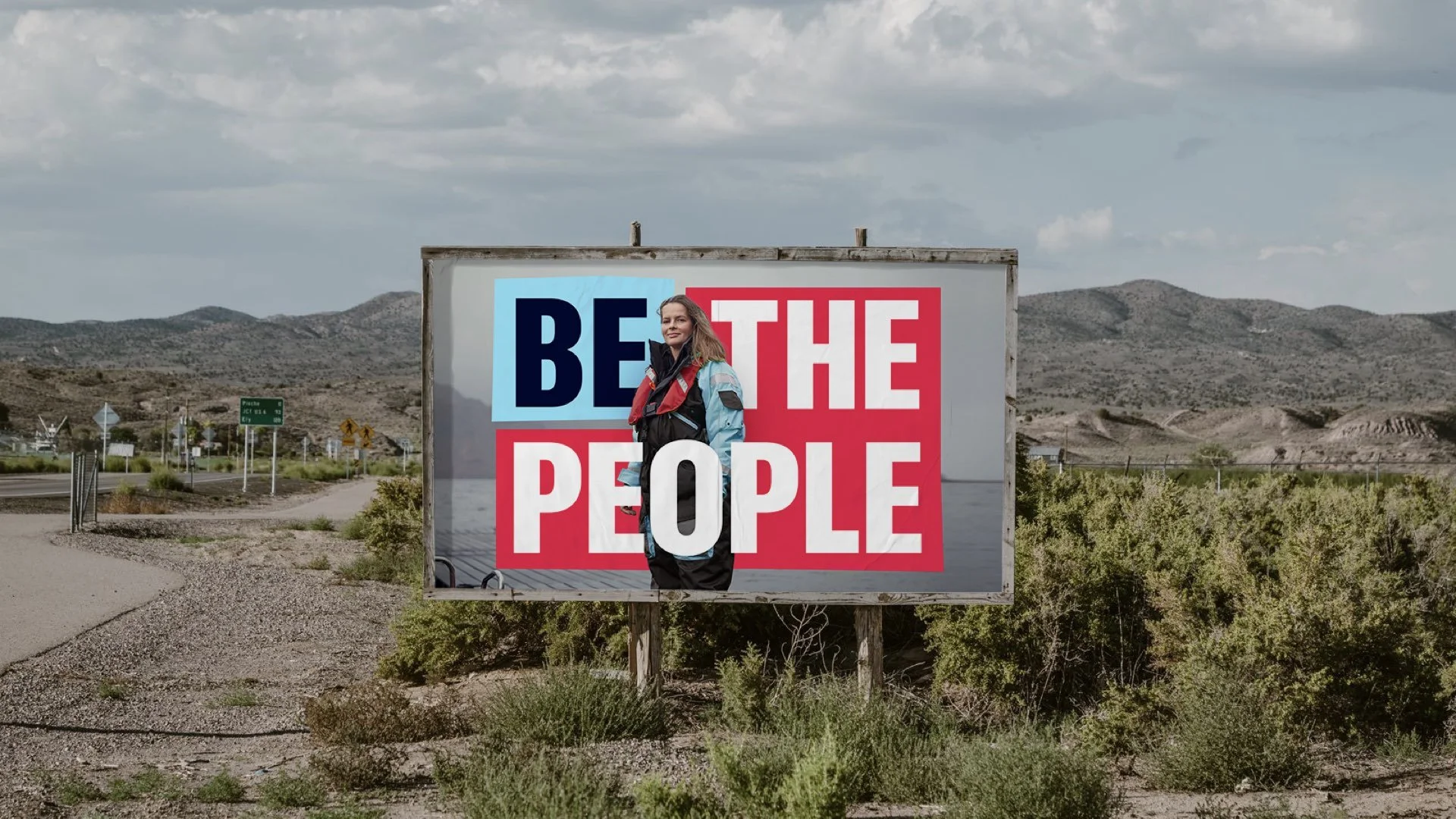
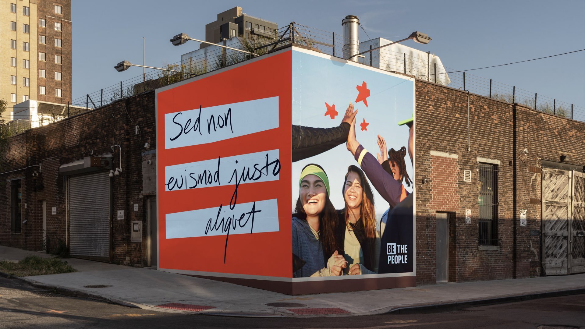
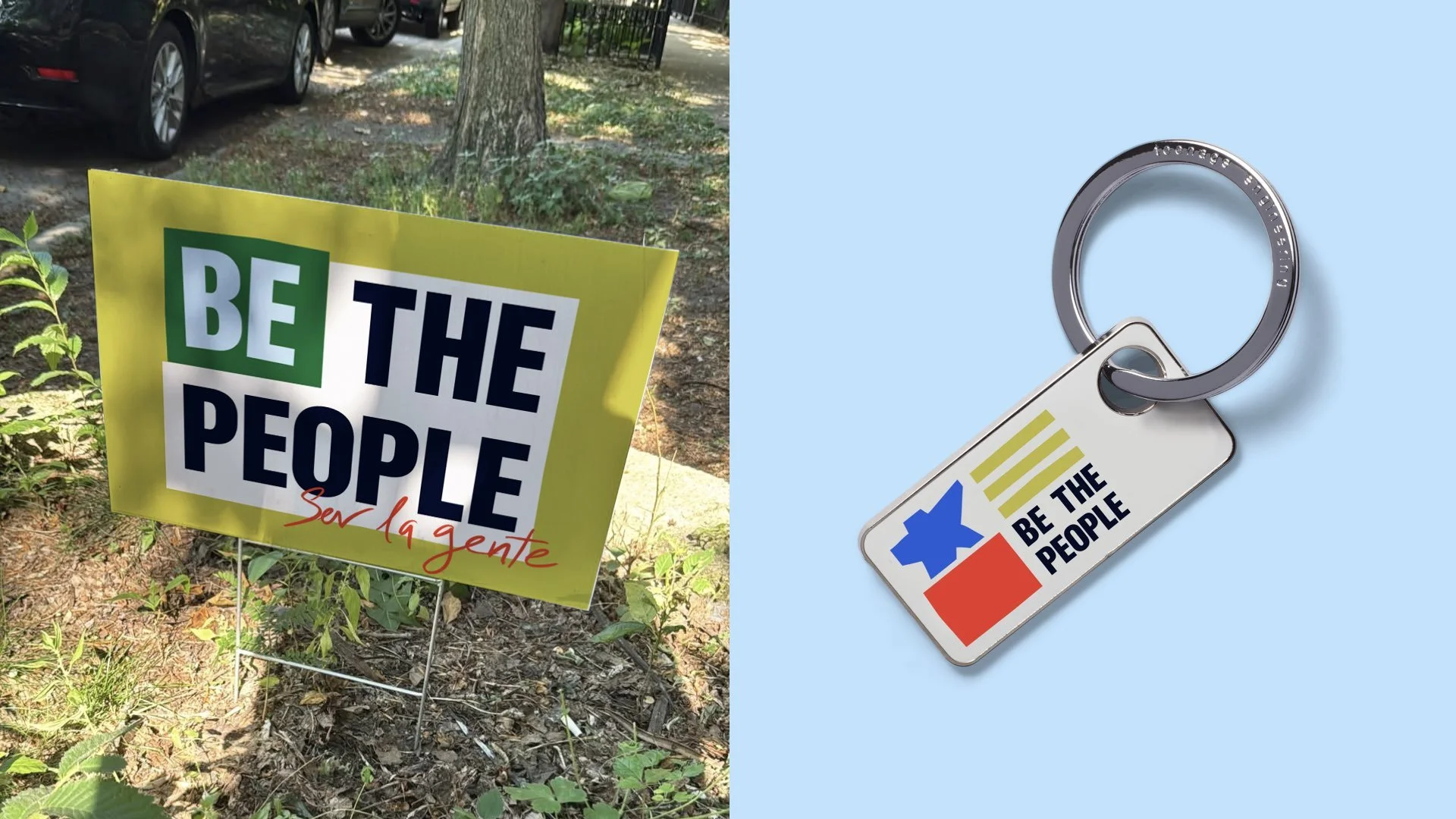
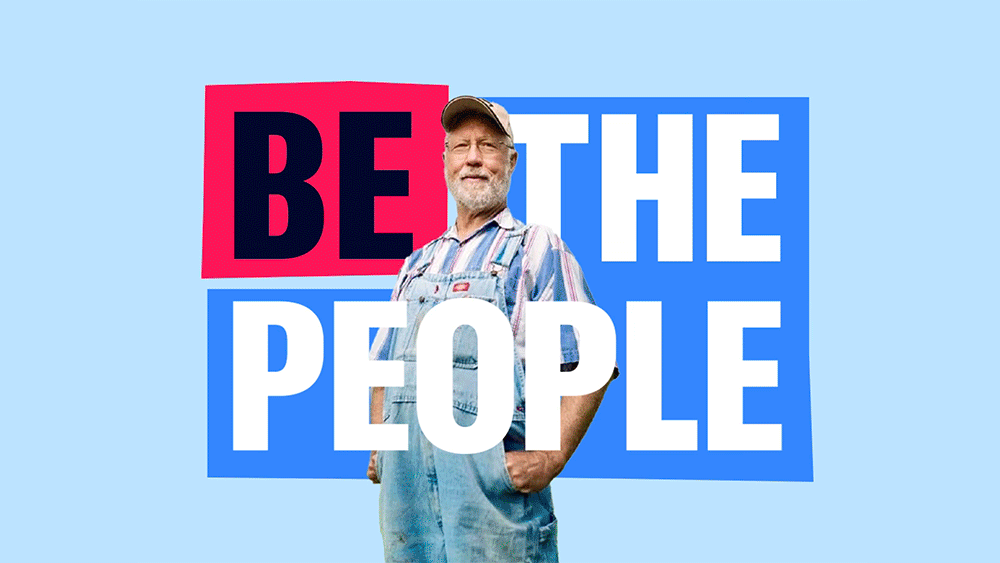
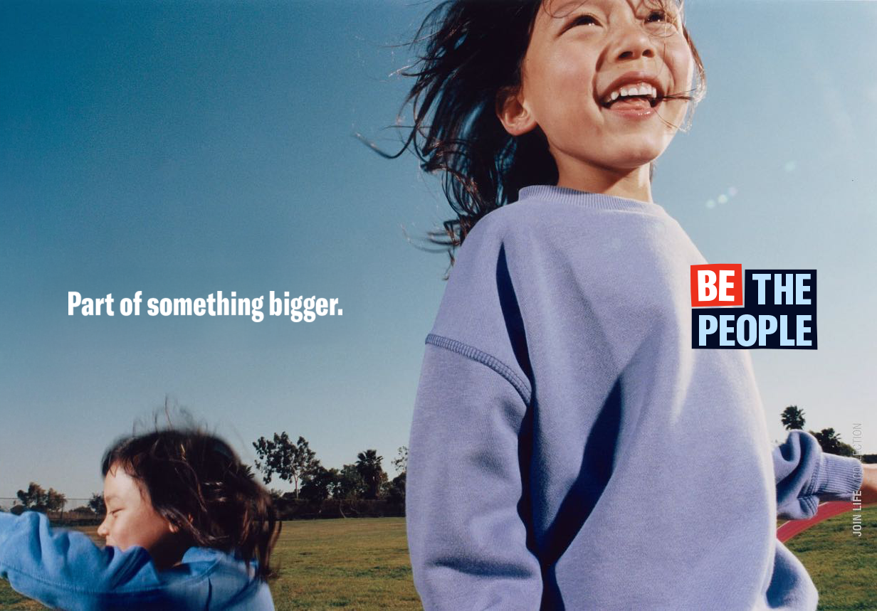
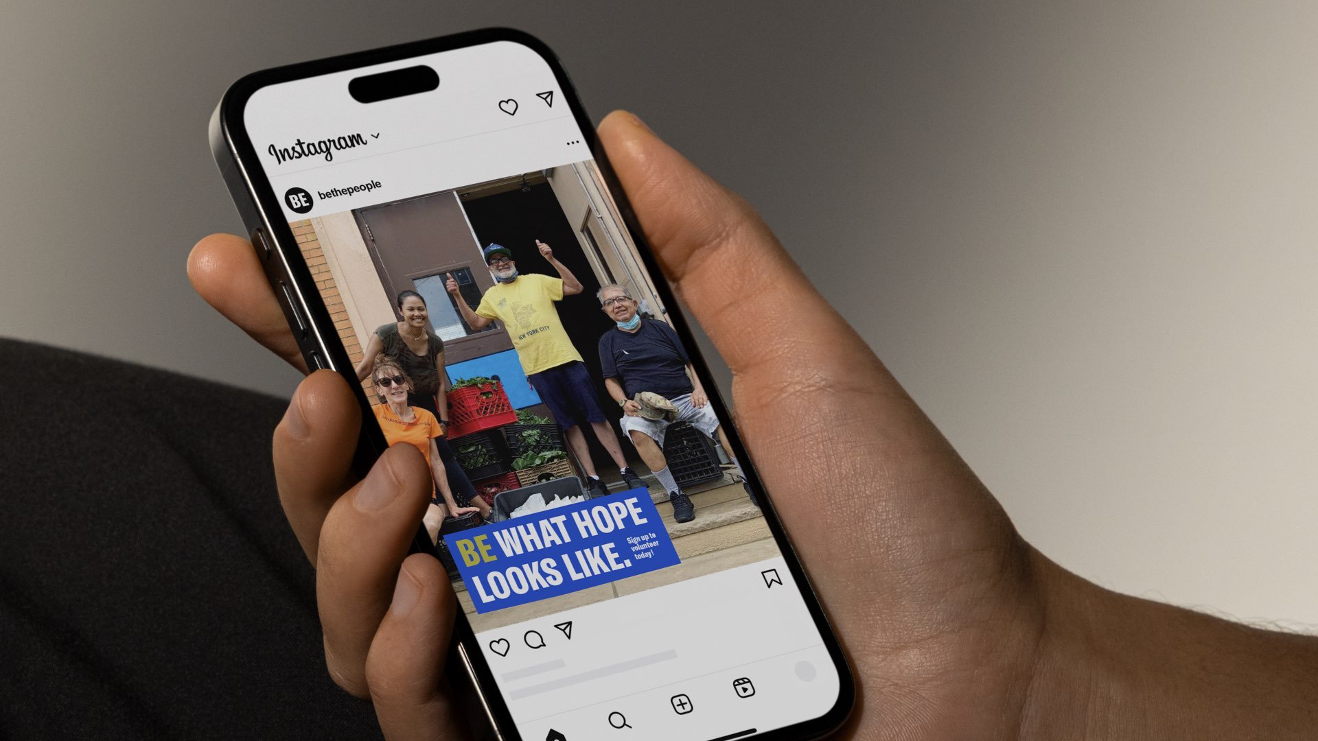
Be the People is a brand platform created to explore what it means to be American today. Developed in the lead-up to America’s 250th anniversary, the project reframes patriotism as something participatory, personal, and rooted in contribution rather than ideology. At a time when national symbols feel increasingly polarized, the goal was to create a system that felt unifying without feeling generic; flexible enough to hold many perspectives while still feeling collective.
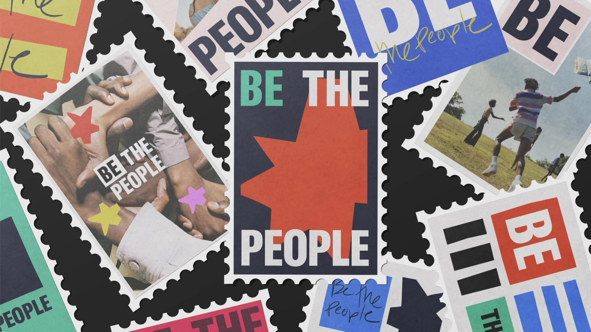
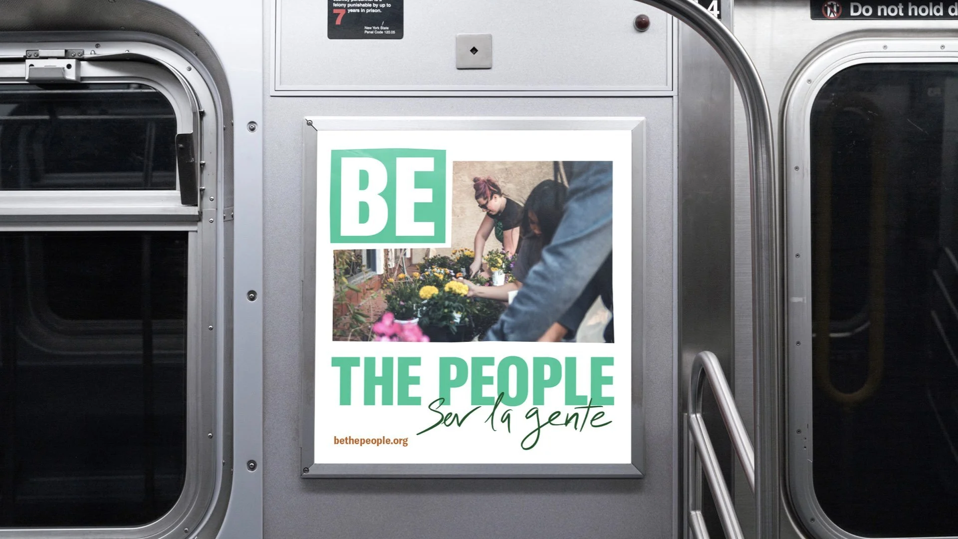
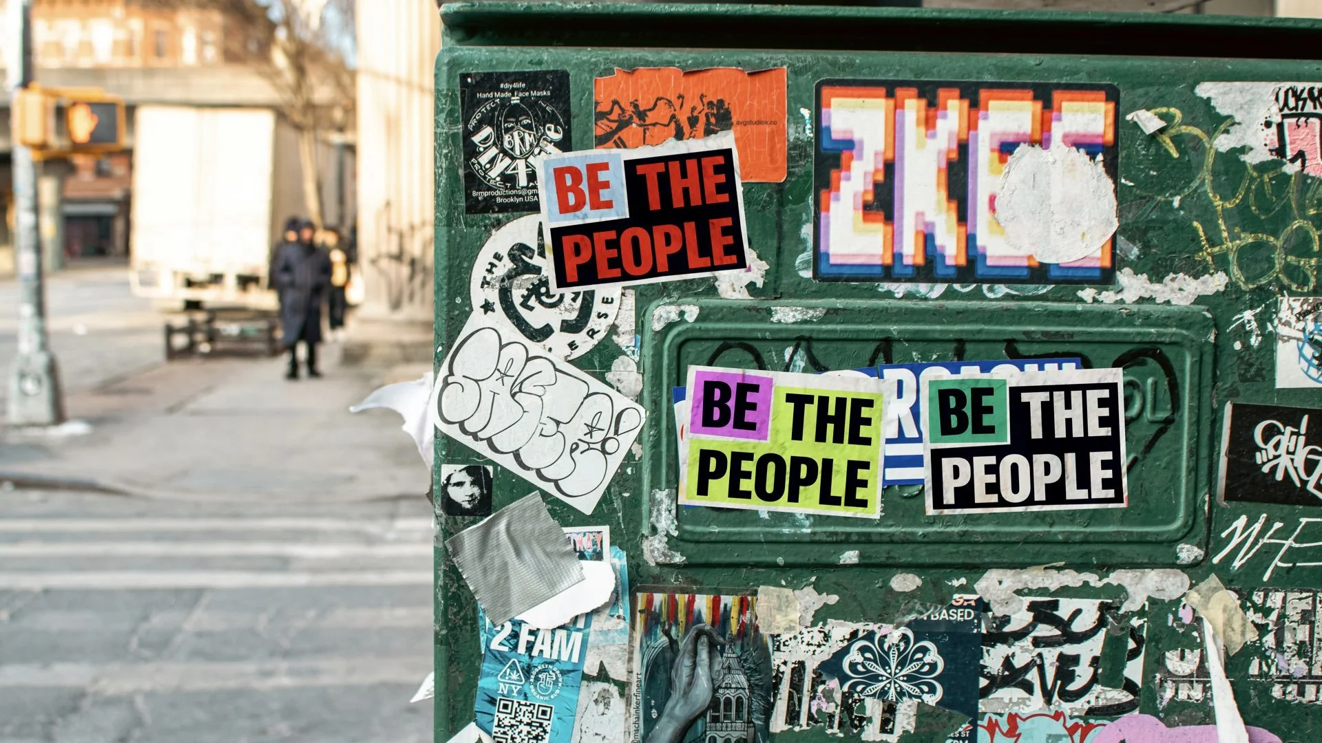
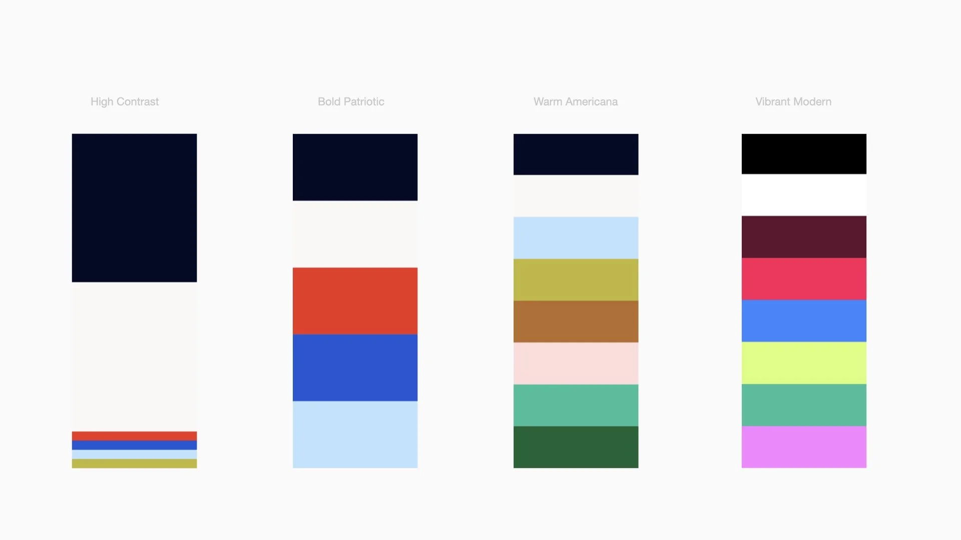
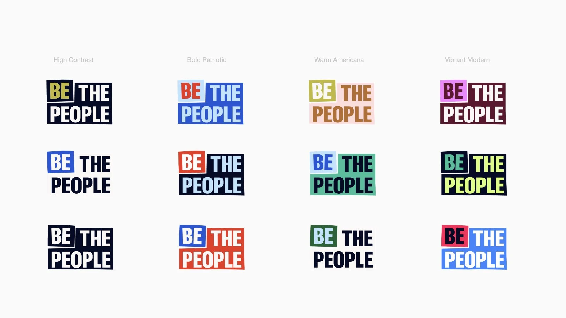
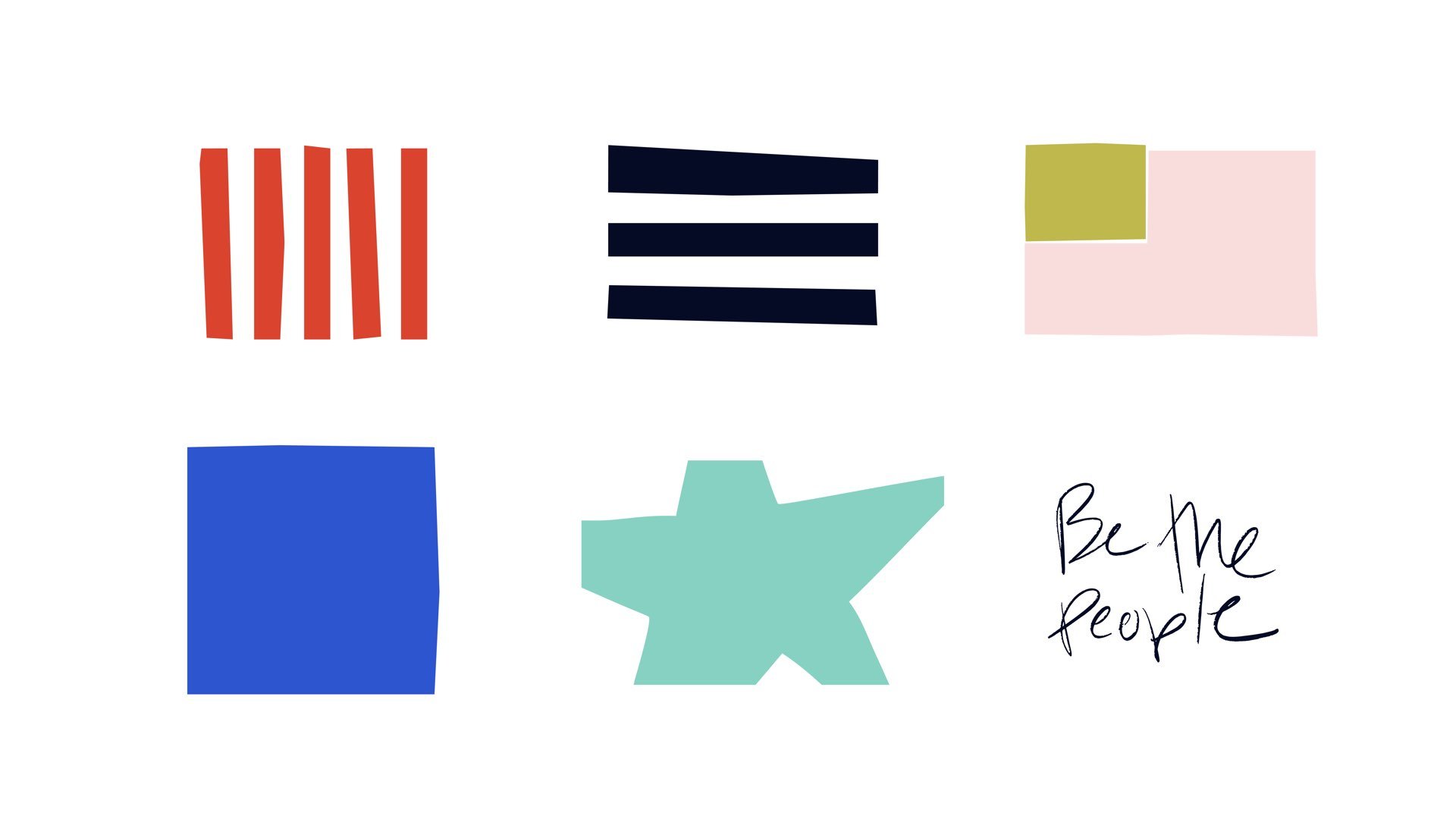
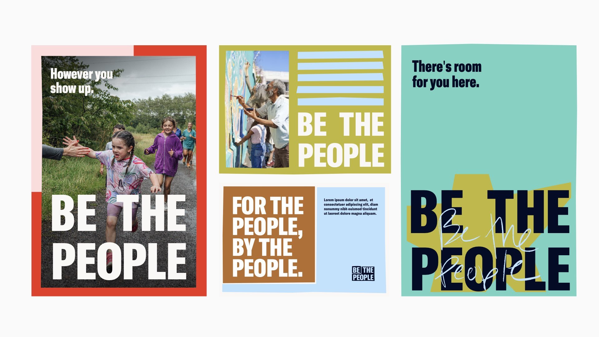
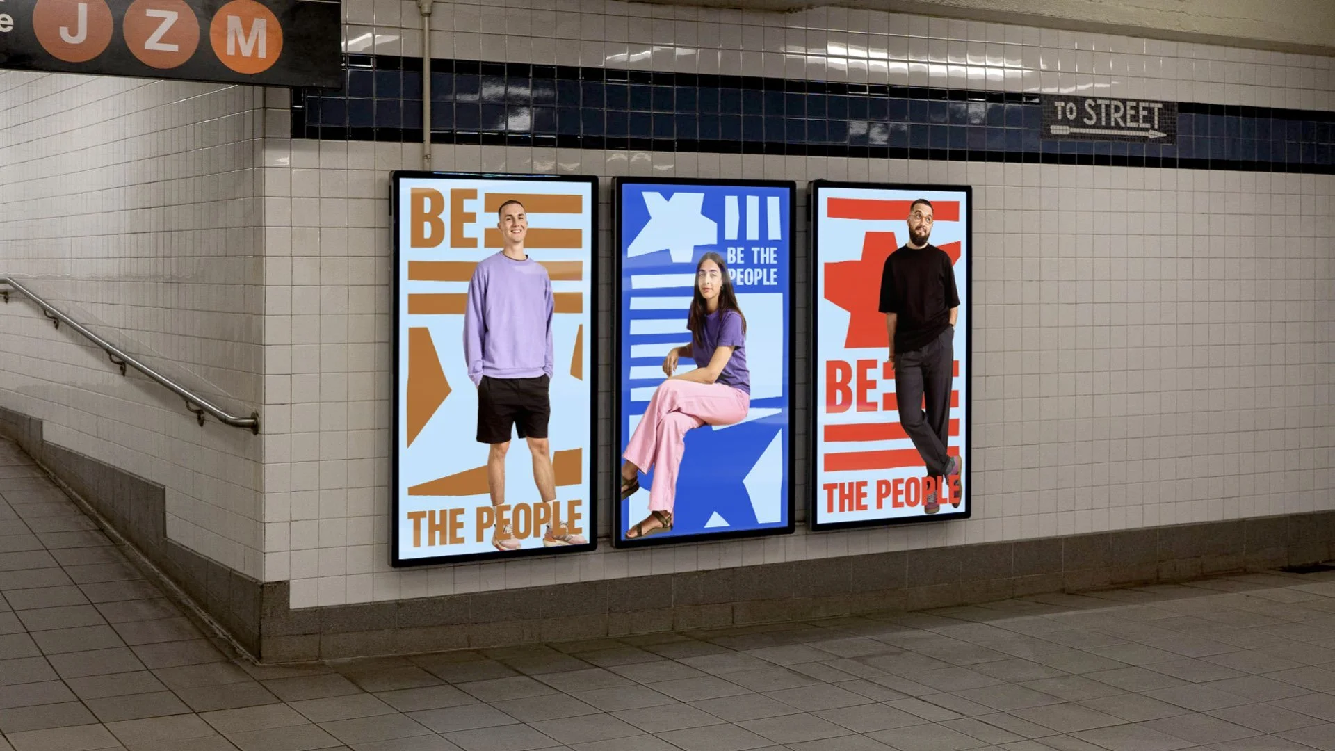
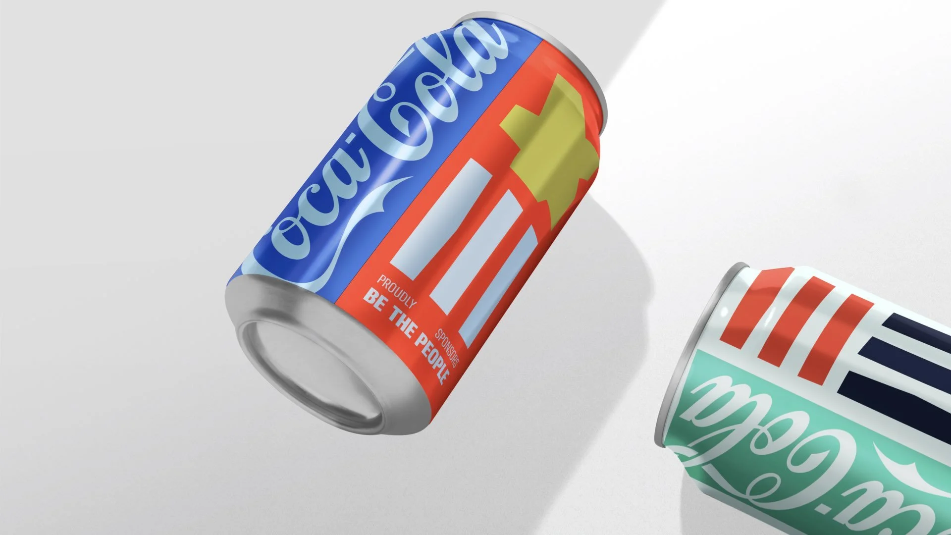
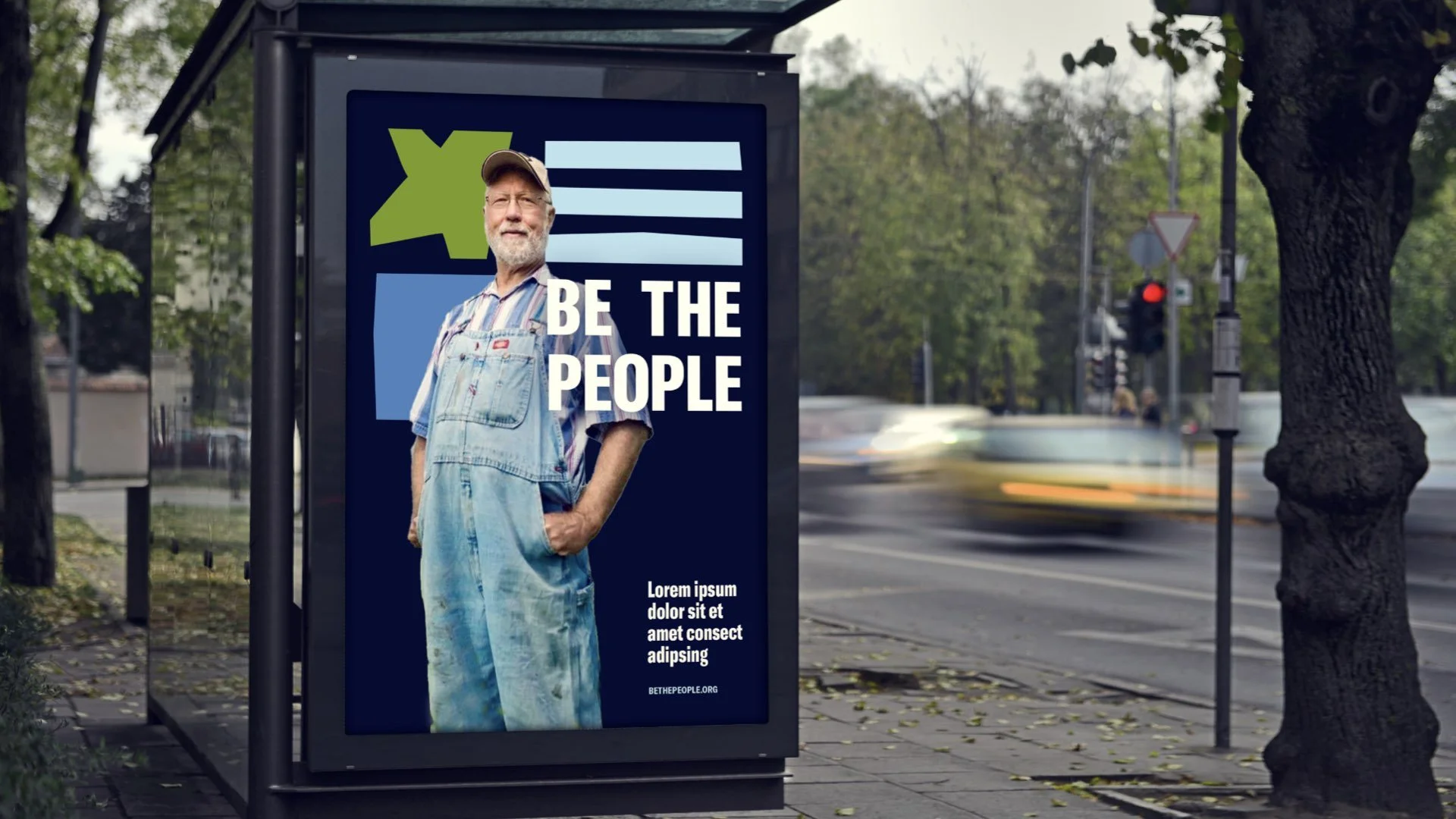
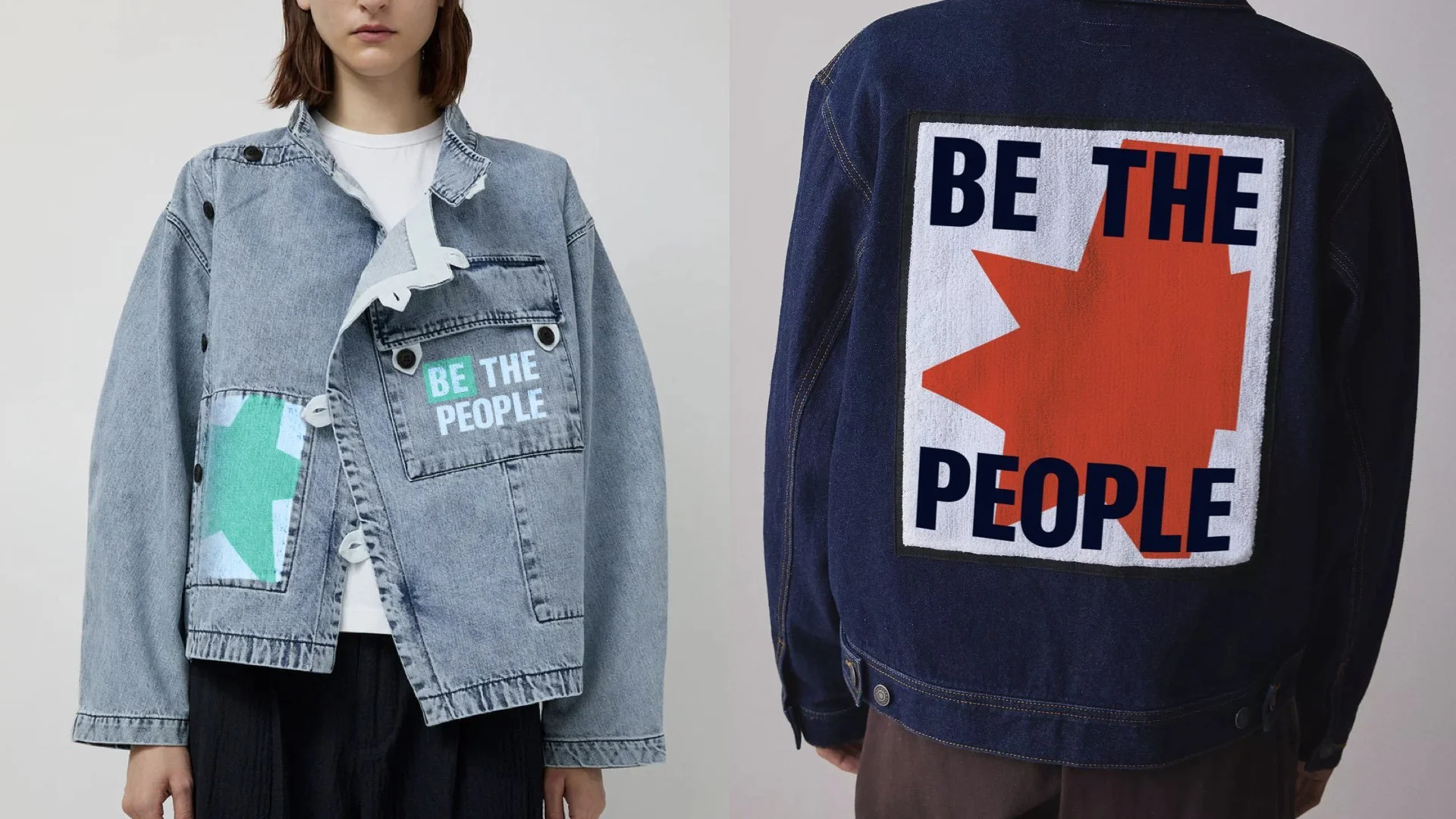
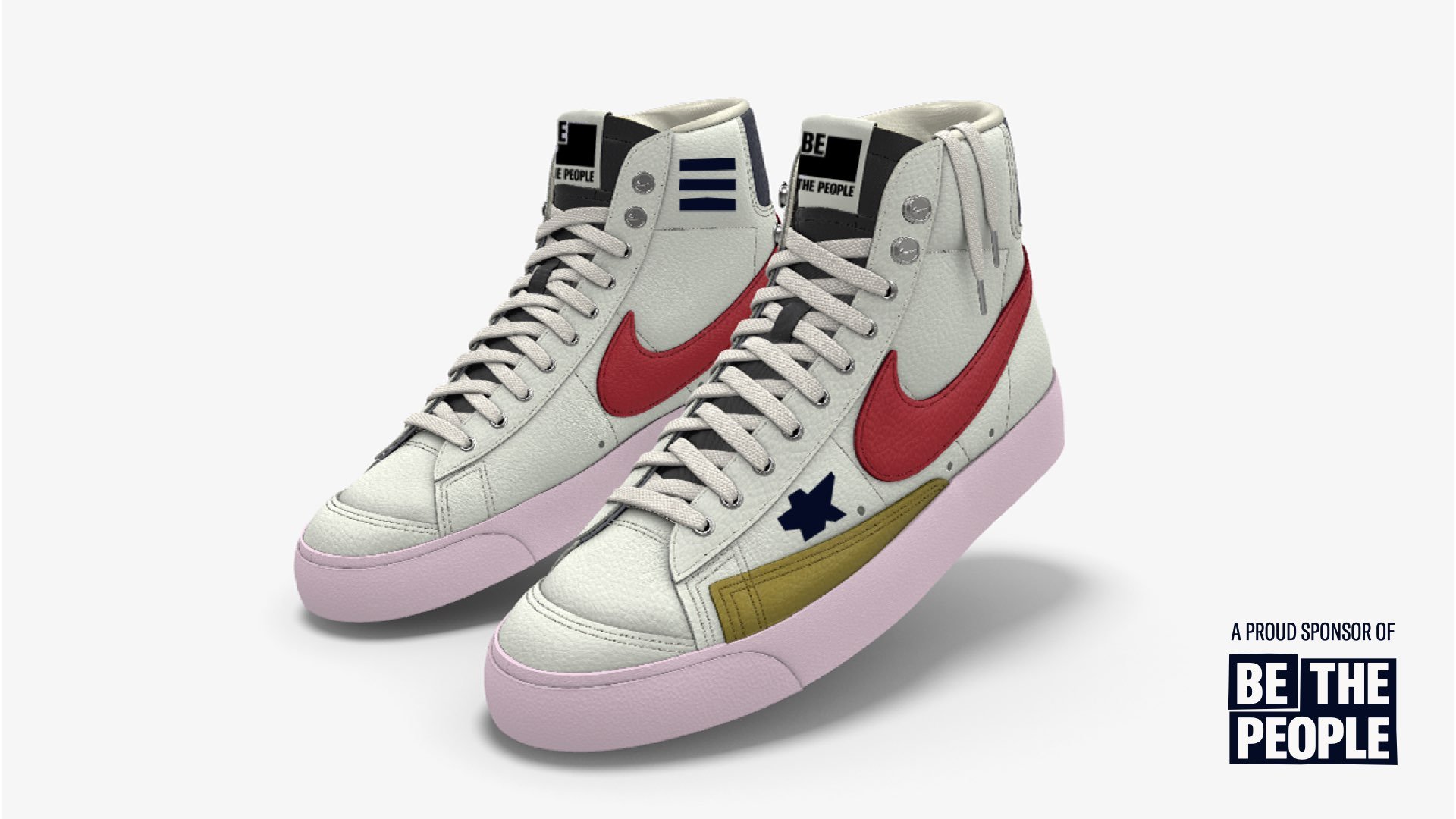
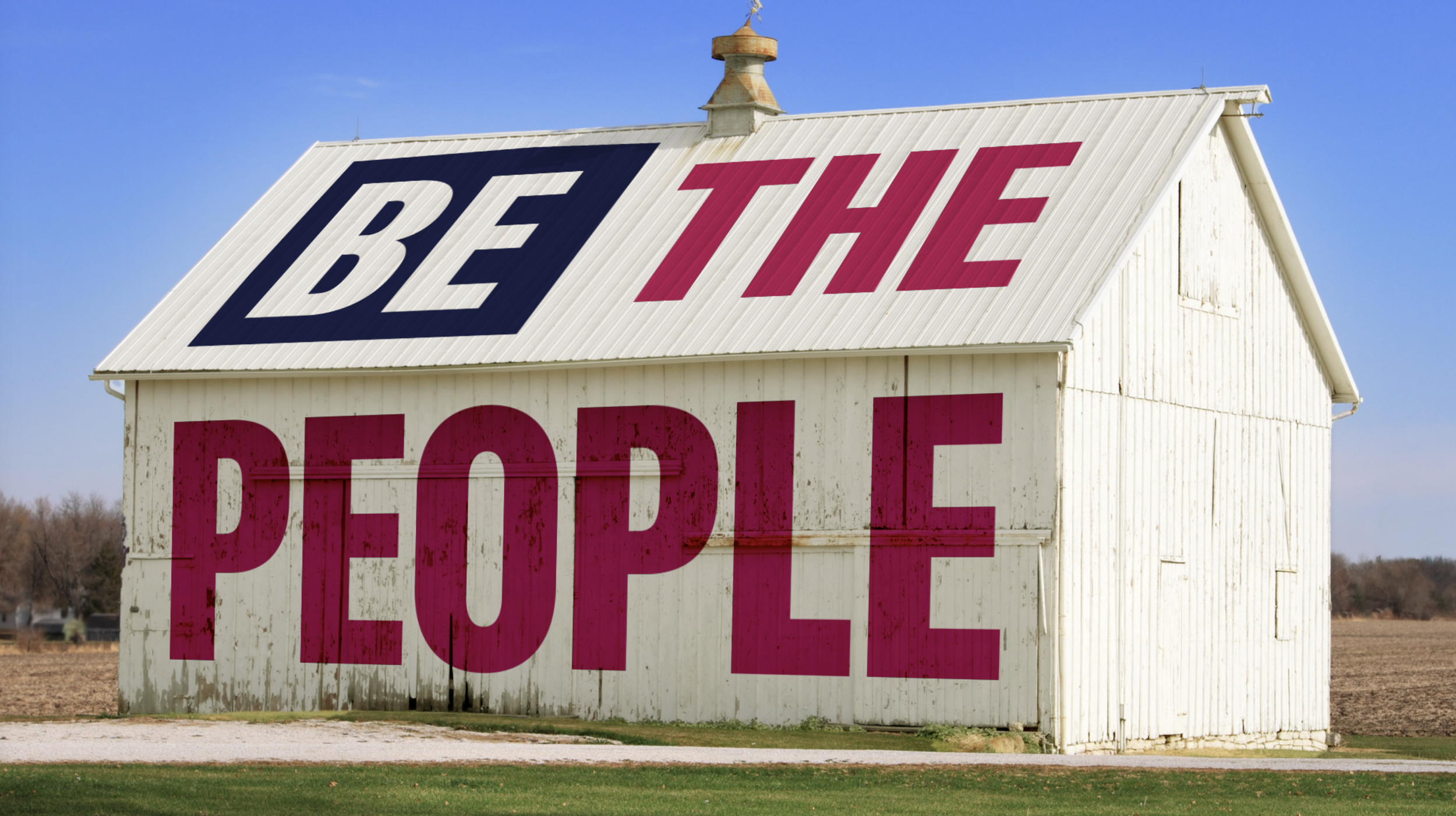
The identity system draws inspiration from the structure of the American flag and the history of American quilting traditions. Naming my “The Fabric of Us,” this brand identity uses modular forms, patchwork-inspired graphics, and layered textures to reflect a country shaped by many different people, experiences, and stories. Like quilts themselves, the system is designed to feel lived in: imperfect, adaptable, repaired, and constantly evolving over time.
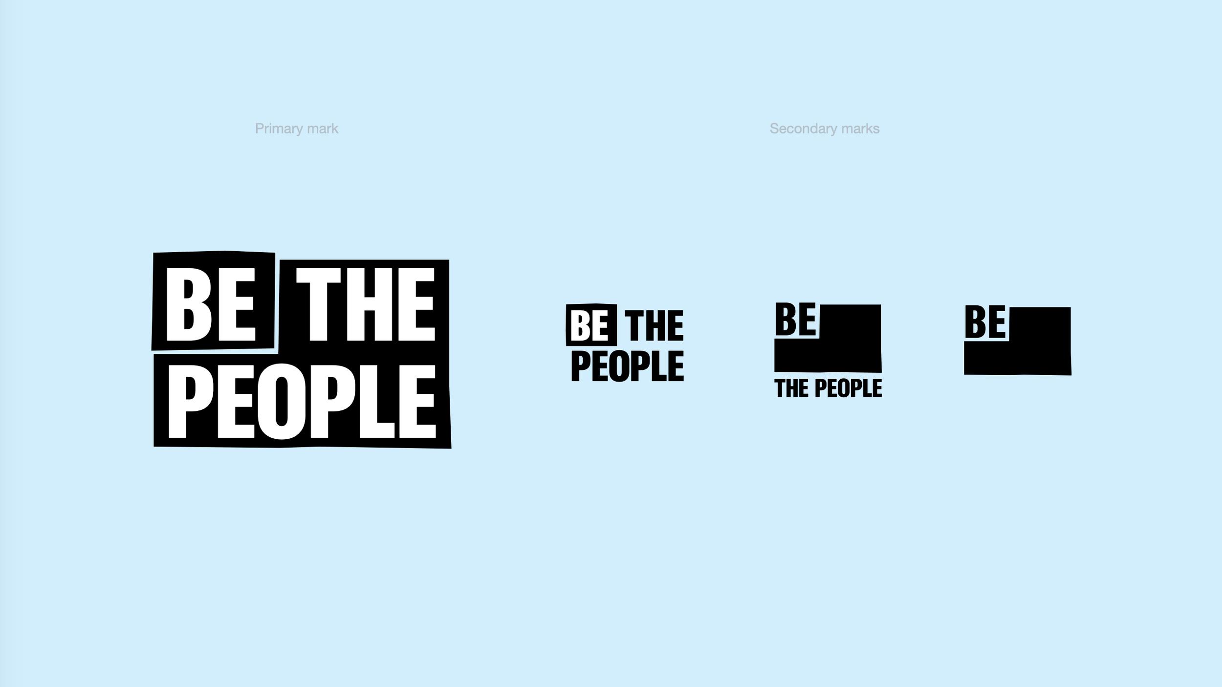
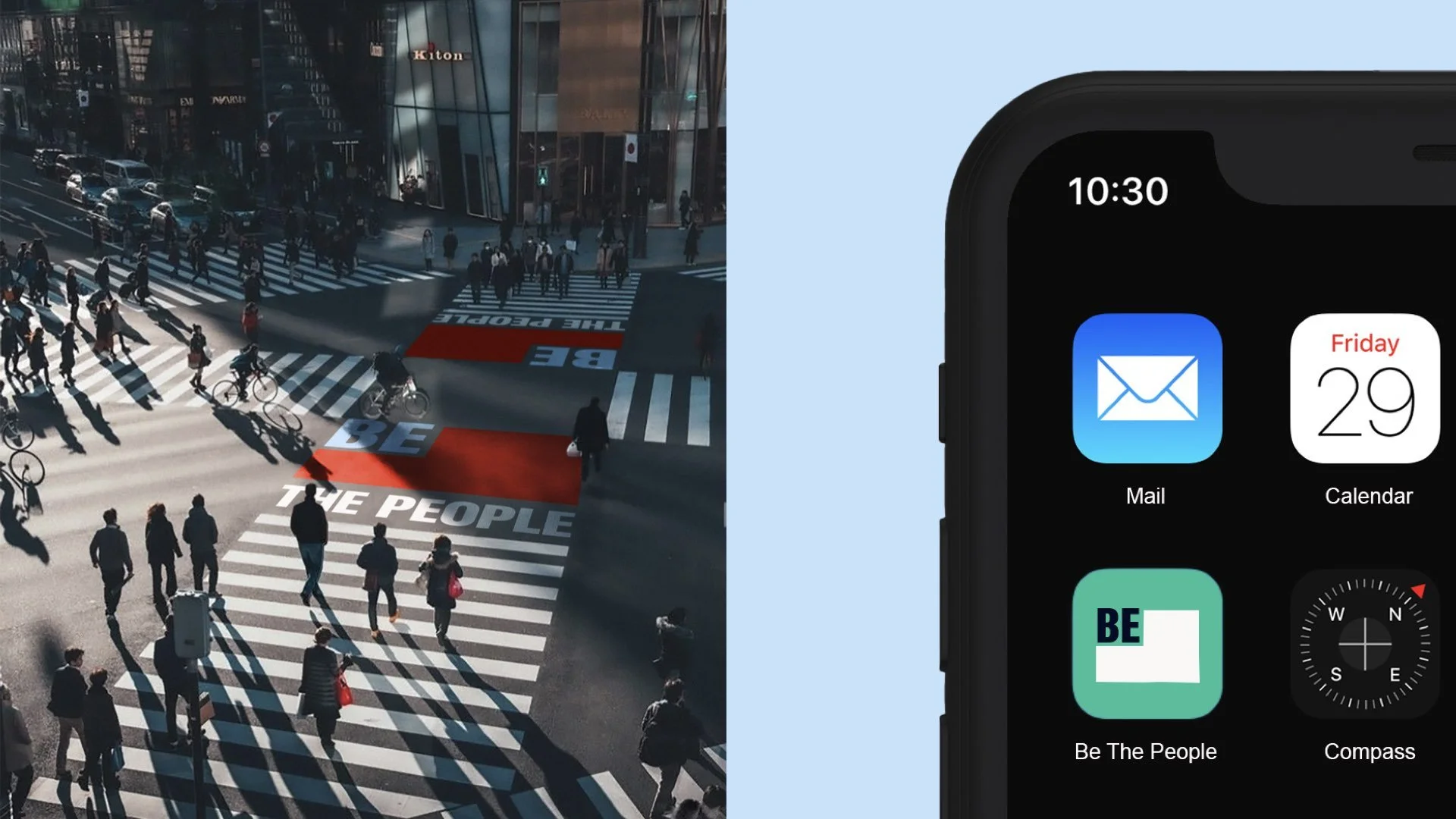
At the center of the identity is a simplified flag framework used as a flexible container for the “Be the People” message. Rather than relying on a single static logo, the system expands through a broader visual language of symbols, color palettes, typography, and graphic elements that allow the brand to shift across audiences and contexts while still feeling connected.
The work below is my own initial brand identity concept for this project. This work is not for public use or distribution. All image rights go to their respective owners. For direct sources, please reach out.